by Heidi
We had our presentation for the client on Wednesday. We presented few different options regarding front entry space planning, signage, restrooms and exterior.
My team is in charge of the front entry area, and here are our proposals regarding that area:
Here is what the front entry / cash register area currently looks like
Currently the biggest problem for ReStore is the clutter.It's one big open space and all the products are placed all over the floor. Mission Statement and inspirational images are also randomly placed wherever there is free wall space. When you walk in you are overwhelmed, and our biggest challenge was the space planning and organization.
Here is how we approached these problems.
Layout #1
(click on the images to enlarge them)
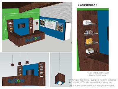
This is the less expensive option, keeping the cash register where it currently is, only framing it and lowering it to meet the ADA requirements. Behind it we designed a built out wall and shelving to house the little Habitat Houses as well as the plasma TV to show slide images of Habitat projects.
Built out wall is painted Blue which is one of the two colors on Habitat for Humanity Logo (blue & green).
Next to Entry, there is another built out wall with images of Past Builds, Mission Statement, Customer Inspired Images, and the amount of houses Built.
Opposite cashier desk on the other side of the isle we designed a storage for shopping carts.Back of this storage also offers a vertical surface to store some of the products like tiles and stones that are in boxes. Keeping them on floor level makes it easier for customers to place them on platform carts.
Custom pendant fixture that I designed are made of reclaimed wood,painted either blue or green inside. They use LEDs which provide high quality light
with low-heat emission and low-energy consumption.
Layout #2
On the second layout option we placed the checkout desk in the middle and added one more cash register for better flow. People with small purchases can exit through the main entrance and people with larger purchases needing a platform cart can exit through garage on the other side of the checkout desk. There is also space between the checkout desk and built out wall that gives people access to see the Habitat Houses more closely as well as video's shown on TV.
Above shopping cart storage you can find the ReStore Map either lowered from the ceiling or attached to the wall.
Other problem areas we tackled were the back wall with restrooms, and the industrial shelving.
There is absolutely no privacy for the restroom area, so I came up with an idea of a privacy wall that also serves as storage area. On the backside are inspirational images of completed Habitat houses and events.
I also proposed this concept for the pegboard on back wall.Shapes or inspirational slogans painted to match logo colors.
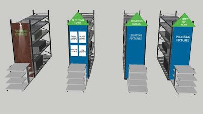
To give more organized and aesthetic look for the long and tall industrial shelving throughout the space, I proposed closing the end of the shelving with panels for added signage.
Here are the 3 different concepts:
Currently the client is reviewing the options and deciding on the direction. I'm looking forward to being part of the implementation portion of the project both in the form of supervising and hands on, and I will keep you posted on the progress.


No comments:
Post a Comment